

Today, as the French celebrate Bastille Day, commemorating the start of the French Revolution, we here at MAP ACTE 3 celebrate the continuation of a revolution of our own - a color-filled, design revolution. This revolution spearheads the transformation of rooms in which art was merely secondary, moving art to center stage, and implementing the theory that art and color affect our state of being.
With France in mind, we reflect on Paris as a design capital of the world, and as one of my favorite cities. Worldwide, Paris is looked towards for inspiration in fashion, cuisine, art, and design. With incredible architectural structures and magnificent museums, like the Louvre, France has been a hub for design, inspiring the rest of the world.
One of my favorite French artists and one of our most popular selling artists, Henri Boissiere, captures the creativity and ingenuity of this spectacular country, combining the philosophy of color theorists with the innovation of graphic design. His inventive blending of colors and shapes serves to create emotional triggers, evoking feelings from viewers of his work. In this way, Boissiere combines science and art, and by doing so, arouses emotional responses from his audience.
Boissiere’s take on color and emotion made me think about this color revolution we’ve commenced, provoking questions about the idea of “feeling in color”. I began to ask myself “How can the color of a room affect the emotions inhabiting it?” I looked towards MAP ACTE 3’s collection for answers, and was inspired by the bold and beautiful colors in works not only by Boissiere, but also by artists like Helen Frankenthaler, Walter Fusi, and Richard Diebenkorn. Here are a few tips for commercial and residential interior designers who wish to give their spaces the emotion they deserve:
Bedroom: Your bedroom is your oasis, your escape, and a place for you to rest and relax. “Cool” colors are proven to make people feel calm and comfortable. Stimulate these serene sentiments with cool blues, and soft greens, that will soothe you ’til you’re snoozing.
http://mapacte3.com/index.php/catalogsearch/result/?q=sybille+hassinger
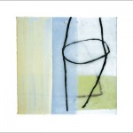 Sybille Hassinger, Untitled, 2002, multimedia
Bath: Cool tones and whites are optimal for restrooms. These colors evoke cleanliness, relaxation, and tranquility; perfect for any “rest"room.
http://mapacte3.com/index.php/artistinfo?pid=109
Office: The color of your office space can truly change your mood, and therefore, your work ethic. Spark creativity by adding blue, and encourage concentration with the inclusion of green. Both are proven to improve productivity in any work space.
http://mapacte3.com/index.php/artistinfo?pid=23
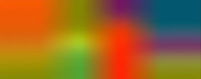
 Henri Boissiere, HEB004A, 2010
Dining room/ Restaurant: It’s no surprise that red is a color of stimulation. Get your guests’ mouths watering before dinner is served by including red in your dining room’s color scheme. Red is said to be the best appetizer, stimulating a desire to eat. Guests eating in a red room might also consider you a better chef, as they may find their food to be better tasting.
http://mapacte3.com/index.php/artistinfo?pid=35
Gym: Red not only stimulates hunger, but also stimulates action. Reds and oranges encourage you to get up and go! Energize your room, and you may end up feeling energized yourself.
http://mapacte3.com/index.php/artistinfo?pid=28
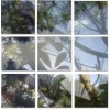
 Bulbfiction, Night Lines, 2012
Welcome Area/Living Room: Cool colors and earth tones are perfect to create a welcoming and comforting atmosphere. These colors open up a space, creating a perfect environment for calm conversation.
http://mapacte3.com/index.php/artistinfo?pid=156
Clinic/Healthcare Provider: Greens, blues, and neutral tones create an instant sense of comfort. Allow patients and visitors to relax by incorporating these tones. You can even include pops of softer yellows in order to evoke feelings of happiness to accompany those of warmth and relaxation.
http://mapacte3.com/index.php/artistinfo?pid=97
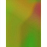
 le Beuan Bénic, Végétaux IV, 2007
A transformation in your color palette could result in a transformation in your attitude. By using Boissiere’s theory, your space will look good, and make you feel even better.
nice post