i want to
SHOP
by
  • DESIGNER ASSIST
  • ADVANCED SEARCH CURATOR

LOG IN

Contemporary

  • The Perks of Having a Wall Flower

    80257

    Spring is in the air and the Earth is blooming. Always the season where florals are in style, Spring has been re-infused with flower power. This timeless classic has been spun on its head with sweet and simple shrubs shrinking down under big, bold blossoms. An overwhelming appearance of over-sized orchids and delicate daffodils has established floral print as a major trend of the season.

    The design world gained a green thumb this Spring, with flower prints springing up everywhere from interiors to runways. What is appealing about this trend is that the small garden of stylistic possibilities has expanded to become an endless field of flower prints. Planted alongside the delicate romance of the quintessential flower print come florals that meet minimalistic interests, and flowers bold and bright. The versatility has drawn all kinds of audiences into the trend.

    While big and beautiful seems to be what has been catching the eyes of many, multiple trends have emerged, leading to the evolution of the traditional flower print. Simplicity is common among floral lovers, as it can be paired with anything and added to any space. On the other hand, striking colors combined with dynamic prints have a way of creating a bold statement, without the need for adding much more. As an accent, flowers create interest and grab attention, without an excessive shock factor. Flower prints can come with few or many flowers. Larger flowers create more of an impact, as they create more focus and can be seen as a statement piece. A print with a flower bunch, conversely, creates interest with a subtle impact.

    Flowers contribute positively to any space as they bring the outside in, creating a nature filled environment, even in a windowless room. In addition, the variety of colors that flowers can be represented in allows for the trend to appeal to just about any taste.

    Spring has sprung! This season there are definitely perks to having a wall-flower... or an entire bouquet!

    anne-montiel-roses-2008 nicolas-le-beuan-benic-vegetaux-21-2012 max-benirschke-petunias-c-1901


  • An Abstract Year Ahead


    TAL126-1200

    Despite our clear vision for the year, 2015 is looking abstract for Map Acte 3. This year we are highlighting the new artwork of two female abstract artists: Alison Black and Chantal Talbot. What these artists have in common is their talent for abstraction and their incredible ability of capturing movement, through their unique brushwork and focus on texture. While their styles and concepts differ immensely, Black’s and Talbot’s talents are evident in their works of art.

    Some of you may be familiar with the work of Alison Black from our website. Although she has previously focused on creating works, featuring portraits of familiar faces from popular culture, our latest collection of Black’s work features vibrant and active brush strokes that come together to create warm and lively pieces of art. Black creates expressive scenes through her use of energetic hues and evocative applications of color. These abstract works generate emotion in ways unlike her portraits, but use the same powerful colors to do so.

    Talbot, on the other hand, uses subdued and monochromatic palettes in order to express movement and life in her active seascapes. Her artwork represents a conflict – as cool, peaceful hues take on the form of an active, tormented ocean. These dark scenes communicate the force of the sea. Talbot’s work is emotional – full of passion and action.

    These expressive works of art have been added to the Map Acte 3 collection for the year 2015, bringing some life and action into the new year.

    http://mapacte3.com/index.php/newartwork.html


  • Faves for Fall: Our Picks for the Season

    pol926 fall

    There’s nothing like the crunch of red and yellow leaves under your boots as you walk through the crisp, Autumn air. This time of year, nothing excites me more than falling leaves, warm scarves, and pumpkin spice!

    Inspired by the color and beauty of this Fall season, I decided to take a picture of the gorgeous leaves that surround me, and create a spread of my favorite artworks that remind me of the Autumnal season. After all, the paintings channel the beauty of the season, and of the leaves, which seem to paint the ground you walk on. These paintings are warm, inviting, and just as unique as each fallen leaf.

    Take a look at my favorite, beauti-fall works of art that channel the spirit of the season.

    weg291 fallroom and board fall season wall


  • A Case of the Blues: FALLing for Blue

    blue blog

    This Fall, everyone’s got the blues… and so do we! This infectious Fall trend has taken over the design scene. Blue has been popping up everywhere – in our closets, and in our homes – and in a variety of shades – from soft sky blues to nautical navies. Blue in any shade combines easily with most colors and can serve as both a neutral and as an accent.

    Forget 50 shades of blue, we’ve got more than that. We’ve got a real case of the blues. And since blue is the new black – at least this Fall – we want to help you make the transition from blah to blue. This has become easy, on our new website. Search by color and immerse yourself in this trendy hue. Bring beautiful blues into your closets and homes.

    blues website

    We’ve got the blues, and we've got some for you!


  • Speak From Your Art: Self-Expression in Fashion & Design

    Art doesn’t just get up and walk away. It struts. It struts down the catwalk, to the sidewalk, and into our homes. Fashion is art, and art is fashion.

    Anyone who has ever met me knows that I love fashion. Every morning, when I enter my closet to get dressed for the day, my creativity is sparked. The excitement of incorporating different colors and textures and sometimes even styles prepares me for what I will encounter during my day at the office. The simple process of getting dressed has become, for me, an artistic process. Even though the final product is what seems most rewarding, the process of getting dressed is truly the best part. Fashion has made each of us artists in our own merit. Each accessory works like a brushstroke in the final masterpiece that is your outfit for the day. In this way, the art of dressing becomes just as expressive as a fine art work.

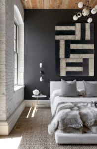
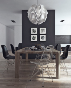
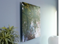
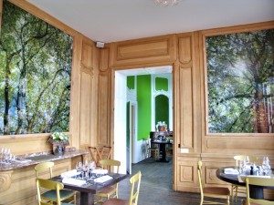
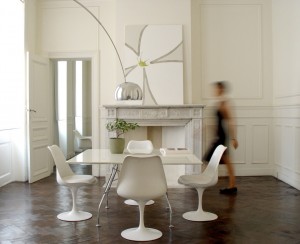
    This creativity is not limited to fashion, however. Interior design is a form of self-expression, as well. A good look at your interior space should give you just as much pride and confidence, as a look at your reflection in the mirror after you get dressed in the morning. Each require the same amount of care, taste, and thought.

    The connection between art and fashion has become deeper over the years. That bond has become more explicit with the immersion of the contemporary fashion world into that of museums. The epitome of this notion is the Metropolitan Museum of Art’s annual exhibition dedicated to fashion as art. Yet, fashion has not only become part of public cultural displays, but has also permeated the world of private decoration.

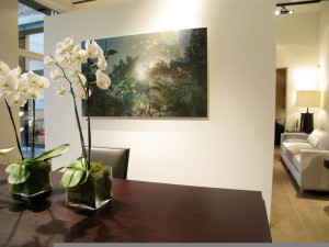
    Trends cross over from the runway to the home so quickly, they occur almost simultaneously. In this way, interior design trends mirror fashion trends. This is evident in the work of fashion designers worldwide. Patterns, colors, and themes in fashion reflect those in art and design. The convergence of these elements has blurred the line between what is considered art and what is considered fashion. This, in turn, has converted our interiors and our wardrobes into canvases. Fashion and interior designers have picked up on this and have begun welding design trends with artistic influences, recreating masterpieces, in ways that allow the public to celebrate them as more than just visual art.

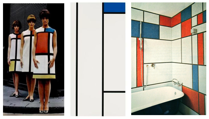
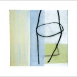
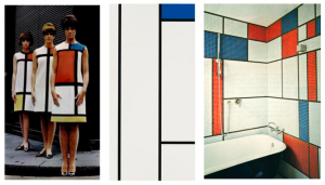
    Inspired by Piet Mondrian’s grid paintings, Yves Saint Laurent thought outside the box, and created a collection of mod dresses. The abstract movement, which Mondrian was a part of, blended exceptionally with the minimalist fashion that followed. Then, this “Less is More” mentality was brought indoors, and is used by interior designers. Drawing on Mondrian’s use of grids, these minimalist and color block styles are frequently used for interiors, and are especially popular for bringing color to the walls of a room.

    piet mondrian blog - fashion

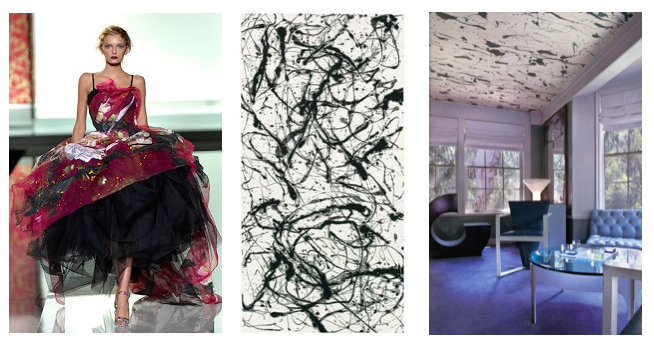
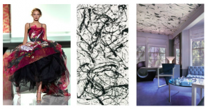
    In the same way, Jackson Pollock’s “drip painting” technique has been the inspiration for various design collections. His style can be seen splattered across magazine pages, runways, and homes.

    Pollock blog - fashion

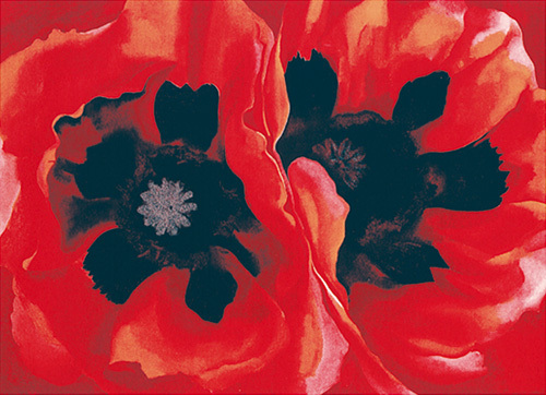
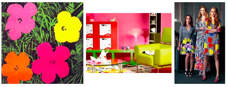
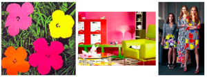
    Recently, the combination of two greats brought Pop Art to the runway. Diane Von Furstenberg incorporated the prints from Andy Warhol’s famous flower paintings and silkscreen prints to put a new spin on her signature style, creating a limited edition collection of wrap dresses and handbags. These bright pops of color and the repetition of shapes and patterns crossed from the runway into the home, and Andy Warhol continues inspiring not only fashion designers, but also interior decorators.

    warhol blog - fashion

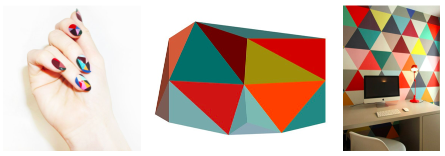
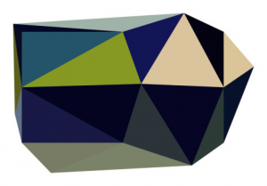
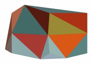
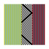
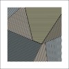
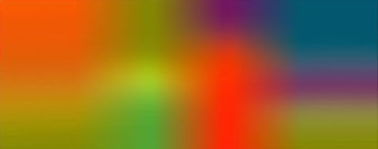
    A heightened interest in geometric shapes has brought a whole new meaning to the phrase “being square”. Squares, circles, and triangles dominate this bold trend. A modern spin has been placed on the use of these shapes in design, and they are again becoming the inspiration not only for fashion and home decor, but also for make up trends. Combining these geometric elements with bright colors makes for a daring, modern look.

    geometrics blog - fashion

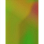
    No matter what inspires you, the one thing that matters is that you are inspired. Whether you choose to combine different movements, trends, and styles, or stick to one, you must ensure that your art, your outfit, your space is what you want it to be. Your art should say what you feel. Your art should reflect who you are.

    Marc Jacobs said, “Clothing is a form of self-expression - there are hints of who you are in what you wear.” Here at Map Acte 3, we say, “Your space, your wardrobe, your art are forms of self-expression - there are hints of who you are in what you create.”

    We hope you continue to express yourselves. We hope you continue to create. We hope our artwork will help you speak from your art!


  • Graphic Content Enclosed! Dare You Not to Look

    henri-boissiere-triangulations-n-2-2013 - graphic BOH074


    Inspired by trends in fashion and home furnishing, 2014 is Map Acte 3’s most daring year yet. The new year brought with it our most graphic images to date. This art work is so bold, so brilliant, you won’t be able to take your eyes off it.

    Paying homage to artists, like Henri Boissiere, Ernesto Riga, and Allan Stevens, these graphic art works incorporate in vogue style trends, like bold black and whites, and edgy geometrics.

    rig981 rig070-071_3 rig066-067_3 rig072-073_1_3 rig982

    An energetic, expressive, graphic piece could complement any interior. Whether the space is commercial, corporate, or residential, displaying a graphic piece could enhance the aesthetic of any room. Graphic art work can serve as a conversational piece in a minimalist space, or could reinforce the style of a bold interior.

    No matter where the graphic work of art goes, it’s sure to grab the attention of anyone in the room. With patterns and colors so eye-catching, a graphic art piece draws people in, screaming “Made you look!”. With art work that bold, how could you not?

    Sean_Scully_Durango Screen Shot 2014-08-05 at 11.32.54 AM Screen Shot 2014-08-05 at 12.50.20 PM


  • How-To: Unwrap a Fresh Look With Plexiglas

    nicolas le beuan benic P1020231

    You ordered your customized plexiglas piece. You eagerly awaited it’s arrival. Finally, you open the door to a big cardboard box. What now? 

    You may be excited to have received your unique Plexiglas print, but you may also be experiencing difficulty moving your Plexiglas piece from a box on your doorstep to an artwork on your wall.

    I’d like to help facilitate this process. Follow these 10, easy steps to unwrap a fresh, new look for any space.

    Before you begin, it may be helpful to note that you will need scissors, an open space, and possibly another person to help you.

    1. Clear a space. This box in which you will receive your Plexiglas piece is big, and the artwork itself is even bigger. Give yourself room to unwrap the piece.

    When you receive your box, it will look something like this.

    DSC_0236

    2. Cut through the tape that holds one side of the box together.

    3. Open the flaps that conceal the work within the box. Inside, you will find a smaller box of cardboard, which is wrapped around the artwork itself.

    4. Hold the wings of the unwrapped side of the box open, and pull the smaller cardboard box out of the larger cardboard box in which it is wrapped. This may be a two-person job. To make this easier, have one person pull the smaller, inner cardboard box, while the other pulls the larger, outer one.

    5. Lay the smaller cardboard box on the floor, in your open space, making sure to keep the side completely covered by cardboard facedown.

    DSC_0230

    6. Open the flaps of the cardboard that are holding the artwork, to expose all of the bubble wrap. Once you complete this, you will find the artwork to be wrapped in bubble wrap with foam securing the edges.

    DSC_0233

    7. Take off the tape that seals the bubble wrap around the Plexiglas piece. You will find this around the edges of the painting, just before the foam on the edges.

    8. Remove the bubble wrap from the Plexiglas piece. At this point, it may help to carefully bring the painting upright, so that the bubble wrap can be removed from the entire work.

    DSC_0242

    9. Remove the sheet of paper that covers the front of the artwork. This will expose the plastic layer that protects the Plexiglas from scratches.

    DSC_0251

    10. Carefully peel this protective layer from the surface of the artwork. It helps to begin at one corner, and then to work your way down and across the work. Be careful not to scratch the work during or after this process.

    DSC_0259DSC_0261DSC_0263DSC_0266

    Once these steps have been completed, your Plexiglas piece will be ready to hang! Attached to the back of the piece of Plexiglas, you will find a wooden frame that should be used in order to hang your work of art.

    Unwrap the crisp clarity offered by any Plexiglas artwork to brighten up your space.


  • Prints on Plexiglas and Aluminum: A New Way to Display

    Screen Shot 2014-07-22 at 12.40.22 PM-2Screen Shot 2014-07-22 at 12.40.30 PM

    Prints on plexiglas and aluminum are two fresh and modern options for art display. The versatility of these options contributes to their popularity. You can not only custom order artworks from MAP ACTE 3’s collection, but can also upload artwork of your own for printing.

    Printing on Plexiglas, which is also known as printing on acrylic, is a MAP ACTE 3 specialty. Our process ensures a 100 year archival rating, with the use of European archival inks and materials that are 100% UV safe. In addition, these museum quality artworks will show no signs of aging, as they will neither crack nor yellow. With an extra layer of protection, we aim to prevent scratches while adding opacity to enliven printed images.

    These crisp, modern prints on plexiglas are not only frame-friendly, but are also ready-to-hang, if you choose to let your unframed work speak for itself. This helpful hanging mechanism leaves your artworks hanging 1 1/4” from the wall, providing a visual fluidity that gives the piece a real sense of presence, as it will look as though it is floating within a space. Being only 4mm thick, these works are also easy to transport.

    Plexiglas hanging - side view  frontback plexi Screen Shot 2014-07-22 at 12.40.46 PM

    Images recommended for printing on this substrate include black and white and color photography, highly textured acrylic paintings, bright watercolors, and organic art in cool, primary tones. These types of images have been proven to enhance the  crisp, luminosity of these prints on plexiglas.

    Art on plexiglas is recommended for light-filled spaces, as the bright, crisp clarity of these works complements and enhances these luminescent atmospheres. The addition of a print on plexiglas could open up any space.

    nicolas le beuan benic 0g RONCHINE 08 3

    Printing on aluminum is an excellent alternative to printing on plexiglas. Although artworks printed on this substrate are 2mm thinner than those on plexiglas, their quality equals that of plexiglas prints. This sleek, ultraslim option is printed using high-quality aluminum and proprietary archival inks, providing the same 100 year archival rating as prints on plexiglas. In addition, the hanging mechanism on the aluminum product is just as easy to use.

    Although the quality of these artworks on aluminum is the same as art on plexiglas, the style differs. All artwork is compatible with this substrate, as the aluminum is pre-treated with a white powder coating, allowing for the accurate presentation of all colors and mediums. Prints on aluminum have a contemporary, industrial quality, with a matte finish, perfect for artworks where it is necessary to eliminate glare.

    nicolas le beuan benic IMG_2660

    Each option, whether on plexiglas or aluminum, provides a sleek, unique alternative to artwork on paper or canvas. These modern artworks are tailored to ensure that your decorative options fulfill your distinctive design dreams.

    For more information about our quality, or our printing process, check out: http://mapacte3.com/index.php/quality/


  • A Color Revolution

    boh2

    Today, as the French celebrate Bastille Day, commemorating the start of the French Revolution, we here at MAP ACTE 3 celebrate the continuation of a revolution of our own - a color-filled, design revolution. This revolution spearheads the transformation of rooms in which art was merely secondary, moving art to center stage, and implementing the theory that art and color affect our state of being.

    With France in mind, we reflect on Paris as a design capital of the world, and as one of my favorite cities. Worldwide, Paris is looked towards for inspiration in fashion, cuisine, art, and design. With incredible architectural structures and magnificent museums, like the Louvre, France has been a hub for design, inspiring the rest of the world.

    One of my favorite French artists and one of our most popular selling artists, Henri Boissiere, captures the creativity and ingenuity of this spectacular country, combining the philosophy of color theorists with the innovation of graphic design. His inventive blending of colors and shapes serves to create emotional triggers, evoking feelings from viewers of his work. In this way, Boissiere combines science and art, and by doing so, arouses emotional responses from his audience.

    Boissiere’s take on color and emotion made me think about this color revolution we’ve commenced, provoking questions about the idea of “feeling in color”. I began to ask myself “How can the color of a room affect the emotions inhabiting it?” I looked towards MAP ACTE 3’s collection for answers, and was inspired by the bold and beautiful colors in works not only by Boissiere, but also by artists like Helen Frankenthaler, Walter Fusi, and Richard Diebenkorn. Here are a few tips for commercial and residential interior designers who wish to give their spaces the emotion they deserve:

    Bedroom: Your bedroom is your oasis, your escape, and a place for you to rest and relax. “Cool” colors are proven to make people feel calm and comfortable. Stimulate these serene sentiments with cool blues, and soft greens, that will soothe you ’til you’re snoozing.

    http://mapacte3.com/index.php/catalogsearch/result/?q=sybille+hassinger

    http://mapacte3.com/index.php/untitled-25195.html Sybille Hassinger, Untitled, 2002, multimedia


    Bath: Cool tones and whites are optimal for restrooms. These colors evoke cleanliness, relaxation, and tranquility; perfect for any “rest"room.

    http://mapacte3.com/index.php/artistinfo?pid=109

    Office: The color of your office space can truly change your mood, and therefore, your work ethic. Spark creativity by adding blue, and encourage concentration with the inclusion of green. Both are proven to improve productivity in any work space.

    http://mapacte3.com/index.php/artistinfo?pid=23

    http://mapacte3.com/index.php/heb-004a-2141.html Henri Boissiere, HEB004A, 2010


    Dining room/ Restaurant: It’s no surprise that red is a color of stimulation. Get your guests’ mouths watering before dinner is served by including red in your dining room’s color scheme. Red is said to be the best appetizer, stimulating a desire to eat. Guests eating in a red room might also consider you a better chef, as they may find their food to be better tasting.

    http://mapacte3.com/index.php/artistinfo?pid=35

    Gym: Red not only stimulates hunger, but also stimulates action. Reds and oranges encourage you to get up and go! Energize your room, and you may end up feeling energized yourself.

    http://mapacte3.com/index.php/artistinfo?pid=28


    http://mapacte3.com/index.php/night-lines-2067.html Bulbfiction, Night Lines, 2012


    Welcome Area/Living Room: Cool colors and earth tones are perfect to create a welcoming and comforting atmosphere. These colors open up a space, creating a perfect environment for calm conversation.

    http://mapacte3.com/index.php/artistinfo?pid=156

    Clinic/Healthcare Provider: Greens, blues, and neutral tones create an instant sense of comfort. Allow patients and visitors to relax by incorporating these tones. You can even include pops of softer yellows in order to evoke feelings of happiness to accompany those of warmth and relaxation.

    http://mapacte3.com/index.php/artistinfo?pid=97


    http://mapacte3.com/index.php/catalogsearch/result/?q=benic le Beuan Bénic, Végétaux IV, 2007


    A transformation in your color palette could result in a transformation in your attitude. By using Boissiere’s theory, your space will look good, and make you feel even better.


  • Less is More: Minimalist Design

    nicolas le beuan benic appartement dupont  v2004

    To strip something of its embellishments is to beautify it.

    Mies Van Der Rohe would agree. In fact, he might respond with “Yes, after all, ‘Less is More’”. This architect, and many other Minimalist designers believe this to be true.

    These Minimalists believed in stripping everything down to the most simple of elements. Although simplicity is often considered to be cold and personality-less, the opposite is true. Minimalist style makes a statement! Stark whites and clean lines are striking. Sparing pops of bright color and accents of geometrical patterns make this style bold.

    Designer Amy Lau said that “restraint calms the eye and gives everything a sense of purpose.” This is especially true for this Minimalist style. The addition of a piece to a room is a weighty decision, as each lamp, each table, each work of art must make a statement, without clashing or being too overbearing. Because of this, artwork chosen for these Minimalist settings should be of a similar, sleek style. Artists, like Frank Stella, Ellsworth Kelly, Sol Lewitt, Kenith Noland, Barnett Newman, Ernesto Riga, Davide Polla, and Nicolas Le Beuan Benic, have mastered this stark style, capturing the clean lines and clutter-free elements of Minimalism.

    At MAP ACTE 3, we do believe in the beauty of this simplicity, and believe that in design, less can be more. Because of this, we have dedicated a portion of our line to this Minimalist art movement. Our fine art prints collection includes the work of the Minimalist artists mentioned above, and many more. Their clean, bold art works are available on our website as beautiful museum quality open edition silkscreens, art prints and limited edition prints on Plexiglas. With one, bold Minimalist piece you could make a simple, yet strong statement in any sleek commercial or residential interior space.


Items 1 to 10 of 12 total

per page
(12 Items)
Page:
  1. 1
  2. 2