i want to
SHOP
by
  • DESIGNER ASSIST
  • ADVANCED SEARCH CURATOR

LOG IN

Art on Aluminum

  • Prints on Plexiglas and Aluminum: A New Way to Display

    Screen Shot 2014-07-22 at 12.40.22 PM-2Screen Shot 2014-07-22 at 12.40.30 PM

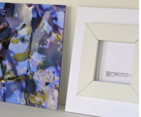
    Prints on plexiglas and aluminum are two fresh and modern options for art display. The versatility of these options contributes to their popularity. You can not only custom order artworks from MAP ACTE 3’s collection, but can also upload artwork of your own for printing.

    Printing on Plexiglas, which is also known as printing on acrylic, is a MAP ACTE 3 specialty. Our process ensures a 100 year archival rating, with the use of European archival inks and materials that are 100% UV safe. In addition, these museum quality artworks will show no signs of aging, as they will neither crack nor yellow. With an extra layer of protection, we aim to prevent scratches while adding opacity to enliven printed images.

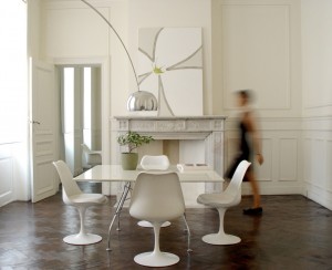
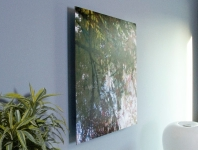
    These crisp, modern prints on plexiglas are not only frame-friendly, but are also ready-to-hang, if you choose to let your unframed work speak for itself. This helpful hanging mechanism leaves your artworks hanging 1 1/4” from the wall, providing a visual fluidity that gives the piece a real sense of presence, as it will look as though it is floating within a space. Being only 4mm thick, these works are also easy to transport.

    Plexiglas hanging - side view  frontback plexi Screen Shot 2014-07-22 at 12.40.46 PM

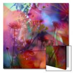
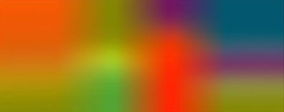
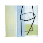
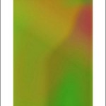
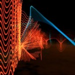
    Images recommended for printing on this substrate include black and white and color photography, highly textured acrylic paintings, bright watercolors, and organic art in cool, primary tones. These types of images have been proven to enhance the  crisp, luminosity of these prints on plexiglas.

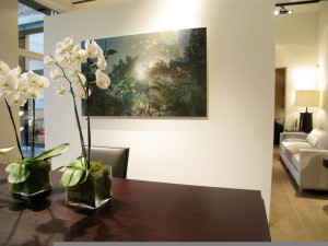
    Art on plexiglas is recommended for light-filled spaces, as the bright, crisp clarity of these works complements and enhances these luminescent atmospheres. The addition of a print on plexiglas could open up any space.

    nicolas le beuan benic 0g RONCHINE 08 3

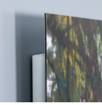
    Printing on aluminum is an excellent alternative to printing on plexiglas. Although artworks printed on this substrate are 2mm thinner than those on plexiglas, their quality equals that of plexiglas prints. This sleek, ultraslim option is printed using high-quality aluminum and proprietary archival inks, providing the same 100 year archival rating as prints on plexiglas. In addition, the hanging mechanism on the aluminum product is just as easy to use.

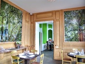
    Although the quality of these artworks on aluminum is the same as art on plexiglas, the style differs. All artwork is compatible with this substrate, as the aluminum is pre-treated with a white powder coating, allowing for the accurate presentation of all colors and mediums. Prints on aluminum have a contemporary, industrial quality, with a matte finish, perfect for artworks where it is necessary to eliminate glare.

    nicolas le beuan benic IMG_2660

    Each option, whether on plexiglas or aluminum, provides a sleek, unique alternative to artwork on paper or canvas. These modern artworks are tailored to ensure that your decorative options fulfill your distinctive design dreams.

    For more information about our quality, or our printing process, check out: http://mapacte3.com/index.php/quality/


  • A Color Revolution

    boh2

    Today, as the French celebrate Bastille Day, commemorating the start of the French Revolution, we here at MAP ACTE 3 celebrate the continuation of a revolution of our own - a color-filled, design revolution. This revolution spearheads the transformation of rooms in which art was merely secondary, moving art to center stage, and implementing the theory that art and color affect our state of being.

    With France in mind, we reflect on Paris as a design capital of the world, and as one of my favorite cities. Worldwide, Paris is looked towards for inspiration in fashion, cuisine, art, and design. With incredible architectural structures and magnificent museums, like the Louvre, France has been a hub for design, inspiring the rest of the world.

    One of my favorite French artists and one of our most popular selling artists, Henri Boissiere, captures the creativity and ingenuity of this spectacular country, combining the philosophy of color theorists with the innovation of graphic design. His inventive blending of colors and shapes serves to create emotional triggers, evoking feelings from viewers of his work. In this way, Boissiere combines science and art, and by doing so, arouses emotional responses from his audience.

    Boissiere’s take on color and emotion made me think about this color revolution we’ve commenced, provoking questions about the idea of “feeling in color”. I began to ask myself “How can the color of a room affect the emotions inhabiting it?” I looked towards MAP ACTE 3’s collection for answers, and was inspired by the bold and beautiful colors in works not only by Boissiere, but also by artists like Helen Frankenthaler, Walter Fusi, and Richard Diebenkorn. Here are a few tips for commercial and residential interior designers who wish to give their spaces the emotion they deserve:

    Bedroom: Your bedroom is your oasis, your escape, and a place for you to rest and relax. “Cool” colors are proven to make people feel calm and comfortable. Stimulate these serene sentiments with cool blues, and soft greens, that will soothe you ’til you’re snoozing.

    http://mapacte3.com/index.php/catalogsearch/result/?q=sybille+hassinger

    http://mapacte3.com/index.php/untitled-25195.html Sybille Hassinger, Untitled, 2002, multimedia


    Bath: Cool tones and whites are optimal for restrooms. These colors evoke cleanliness, relaxation, and tranquility; perfect for any “rest"room.

    http://mapacte3.com/index.php/artistinfo?pid=109

    Office: The color of your office space can truly change your mood, and therefore, your work ethic. Spark creativity by adding blue, and encourage concentration with the inclusion of green. Both are proven to improve productivity in any work space.

    http://mapacte3.com/index.php/artistinfo?pid=23

    http://mapacte3.com/index.php/heb-004a-2141.html Henri Boissiere, HEB004A, 2010


    Dining room/ Restaurant: It’s no surprise that red is a color of stimulation. Get your guests’ mouths watering before dinner is served by including red in your dining room’s color scheme. Red is said to be the best appetizer, stimulating a desire to eat. Guests eating in a red room might also consider you a better chef, as they may find their food to be better tasting.

    http://mapacte3.com/index.php/artistinfo?pid=35

    Gym: Red not only stimulates hunger, but also stimulates action. Reds and oranges encourage you to get up and go! Energize your room, and you may end up feeling energized yourself.

    http://mapacte3.com/index.php/artistinfo?pid=28


    http://mapacte3.com/index.php/night-lines-2067.html Bulbfiction, Night Lines, 2012


    Welcome Area/Living Room: Cool colors and earth tones are perfect to create a welcoming and comforting atmosphere. These colors open up a space, creating a perfect environment for calm conversation.

    http://mapacte3.com/index.php/artistinfo?pid=156

    Clinic/Healthcare Provider: Greens, blues, and neutral tones create an instant sense of comfort. Allow patients and visitors to relax by incorporating these tones. You can even include pops of softer yellows in order to evoke feelings of happiness to accompany those of warmth and relaxation.

    http://mapacte3.com/index.php/artistinfo?pid=97


    http://mapacte3.com/index.php/catalogsearch/result/?q=benic le Beuan Bénic, Végétaux IV, 2007


    A transformation in your color palette could result in a transformation in your attitude. By using Boissiere’s theory, your space will look good, and make you feel even better.


  • Less is More: Minimalist Design

    nicolas le beuan benic appartement dupont  v2004

    To strip something of its embellishments is to beautify it.

    Mies Van Der Rohe would agree. In fact, he might respond with “Yes, after all, ‘Less is More’”. This architect, and many other Minimalist designers believe this to be true.

    These Minimalists believed in stripping everything down to the most simple of elements. Although simplicity is often considered to be cold and personality-less, the opposite is true. Minimalist style makes a statement! Stark whites and clean lines are striking. Sparing pops of bright color and accents of geometrical patterns make this style bold.

    Designer Amy Lau said that “restraint calms the eye and gives everything a sense of purpose.” This is especially true for this Minimalist style. The addition of a piece to a room is a weighty decision, as each lamp, each table, each work of art must make a statement, without clashing or being too overbearing. Because of this, artwork chosen for these Minimalist settings should be of a similar, sleek style. Artists, like Frank Stella, Ellsworth Kelly, Sol Lewitt, Kenith Noland, Barnett Newman, Ernesto Riga, Davide Polla, and Nicolas Le Beuan Benic, have mastered this stark style, capturing the clean lines and clutter-free elements of Minimalism.

    At MAP ACTE 3, we do believe in the beauty of this simplicity, and believe that in design, less can be more. Because of this, we have dedicated a portion of our line to this Minimalist art movement. Our fine art prints collection includes the work of the Minimalist artists mentioned above, and many more. Their clean, bold art works are available on our website as beautiful museum quality open edition silkscreens, art prints and limited edition prints on Plexiglas. With one, bold Minimalist piece you could make a simple, yet strong statement in any sleek commercial or residential interior space.


3 Item(s)

per page
(3 Items)